Game Day Grill
Concept sports grill website
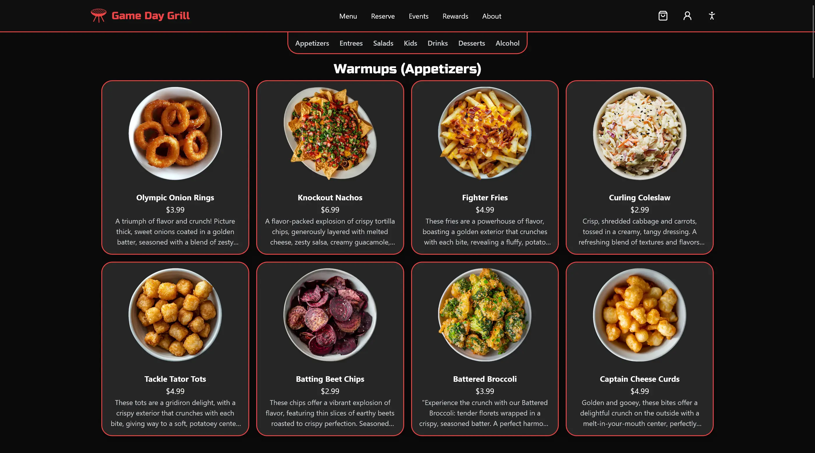
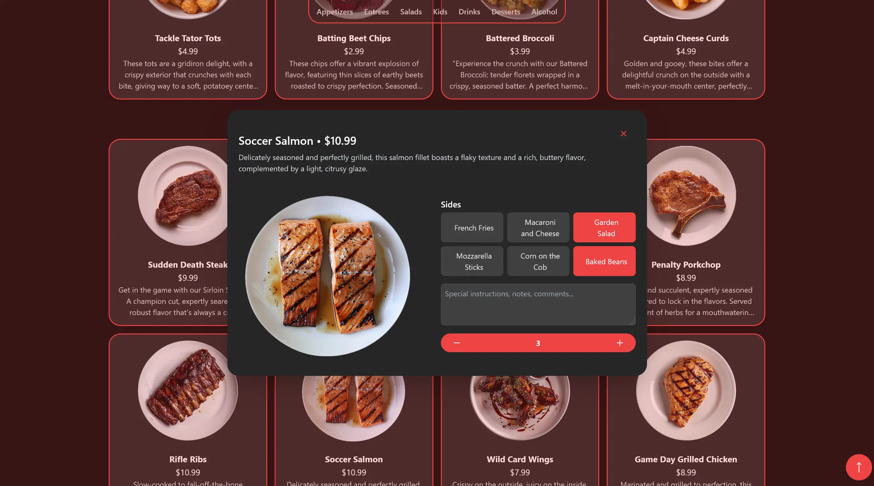
In my programming class, I’m part of Business Professionals of America (BPA). My friends Connor, Salam, Yousif, and I teamed up for the BPA Website Design competition. Our challenge was to build a website for a fictional sports grill named “Game Day Grill.” The website needed to include features like Menus, Online Ordering, Payment options, Special Event Listings, and info on the grill’s location, how to contact them, and how to make reservations.
We decided to use SvelteKit and TailwindCSS to build the website because they were incredibly user-friendly and easy to work with compared to frameworks like React and plain CSS. This made it easy for everyone on the team to contribute some code to the project.
Our team, named “In Memory of Fred,” consisted of:
Connor Cochran: He focused on ensuring the website worked smoothly (Functionality Developer) and helped make it look good (UI Developer).
David Stephenson: That’s me! I was in charge of organizing all the information and tech stuff on the website (Content Manager and Technology Manager) and also worked on the website’s appearance (UI Developer).
Salam Shabsigh: Salam organized the website’s content (Content Manager) and was the main person behind how the website looked (Design Manager).
Yousif Al Khaboori: Yousif helped organize the website’s content (Content Manager) and ensured the website worked well (Functionality Developer).
Together, we combined our skills to create a functional, visually appealing, and user-friendly website.
We took a lot of inspiration from what we liked on other restaurant websites, such as Chipotle, and noted what we didn’t like. This helped us understand what features make a website user-friendly and appealing. Additionally, we looked at Dribbble and Behance for creative ideas and design trends. These platforms gave us a lot of innovative concepts and visuals that we could adapt and incorporate into our own website design for “Game Day Grill.”
Round 1 (Regionals)
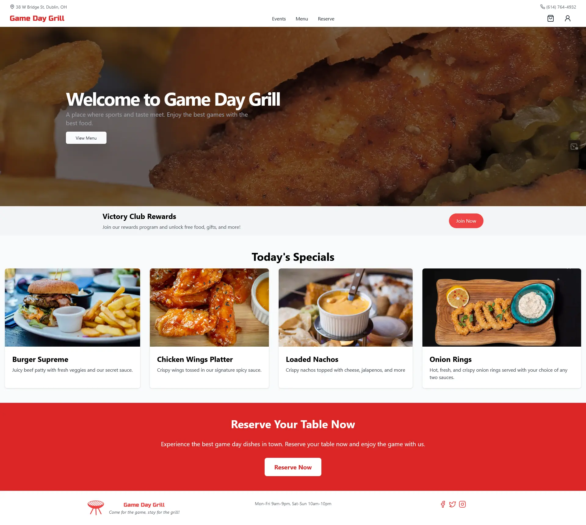
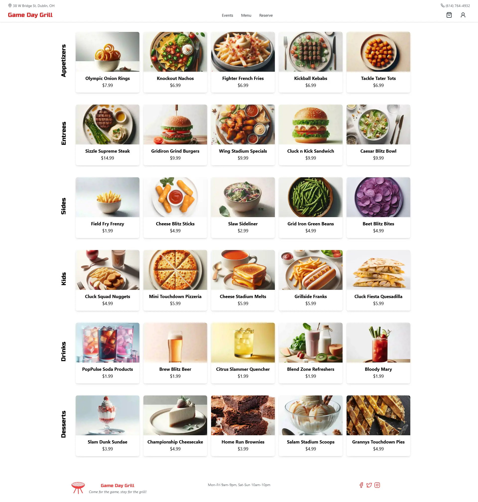
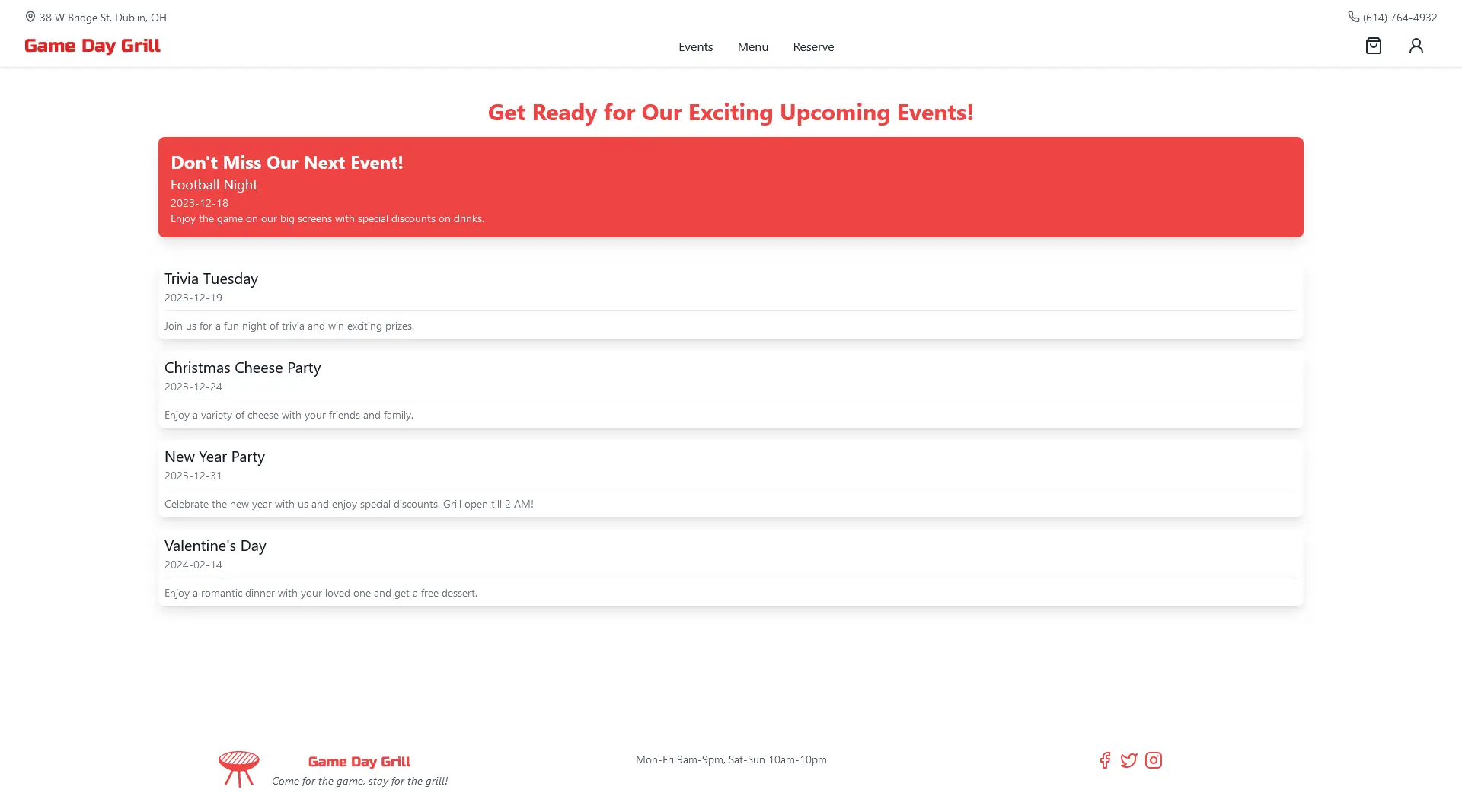
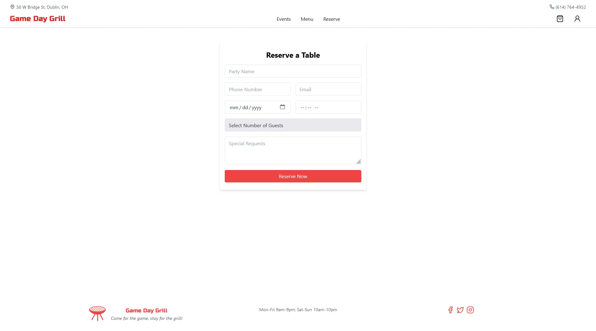
🥳 We won first place and and moved on to the state competition!
Round 2 (States)
Before going to the state competition, we had to make some changes to our website. In our initial version, we neglected mobile design and it had a lot of issues. We decided to fix these issues and make our website more user-friendly. We also wanted to redesign some of the pages to make them more visually appealing and to improve the overall user experience.
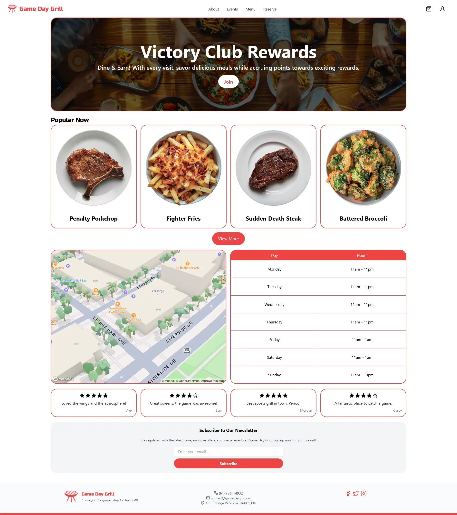
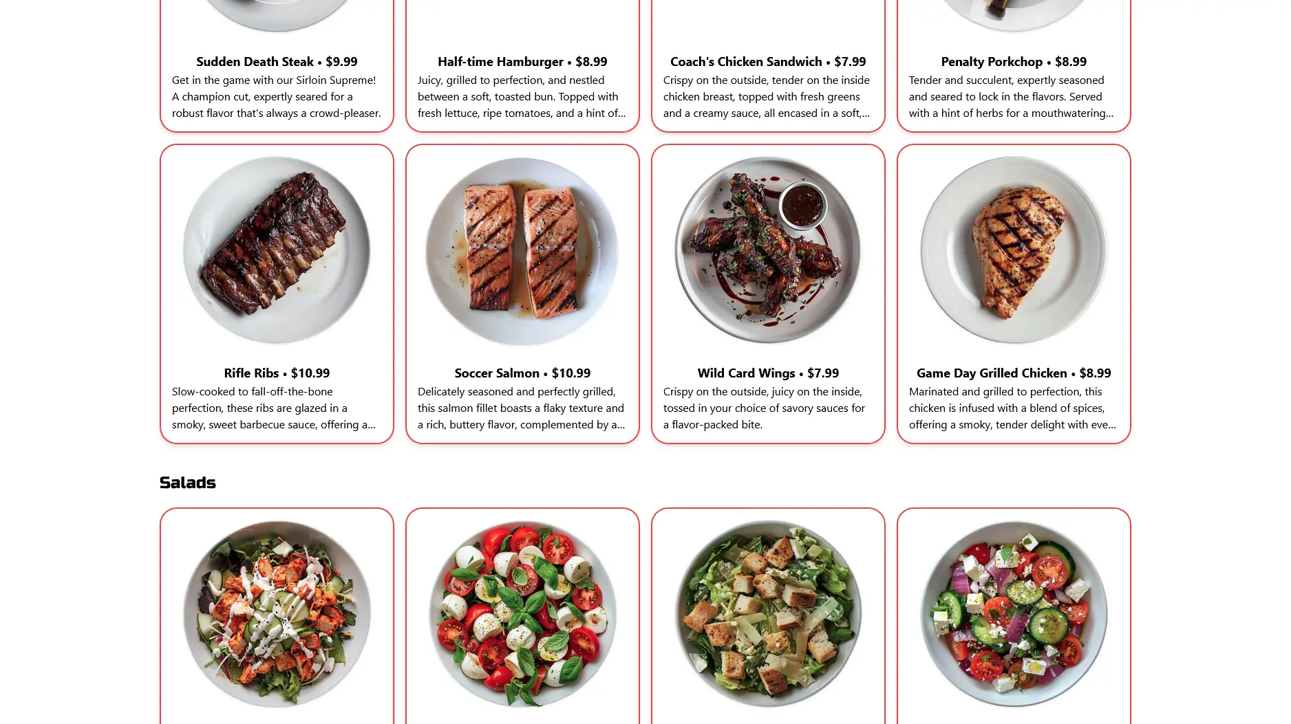
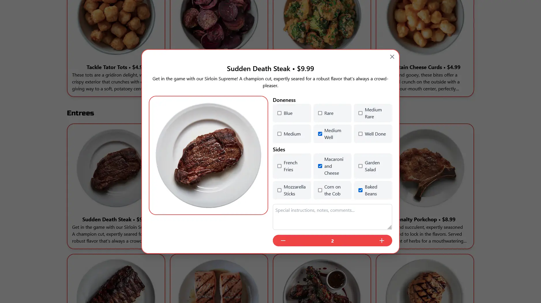
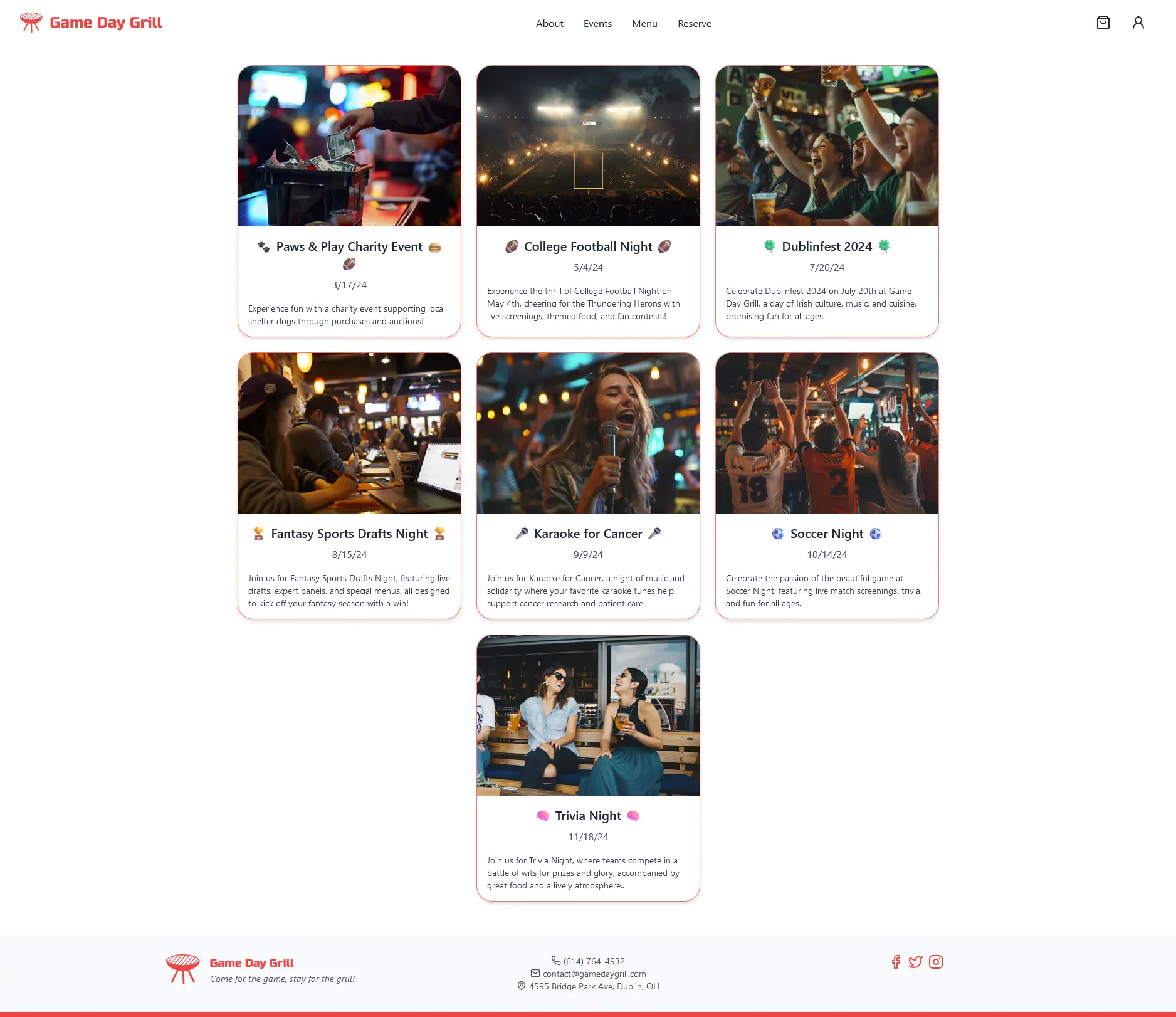
While the state competition was streamed to Vimeo, I am unable to find an archive of the live stream.
🥳 We won second place and moved on to the national competition!
Round 3 (Nationals)
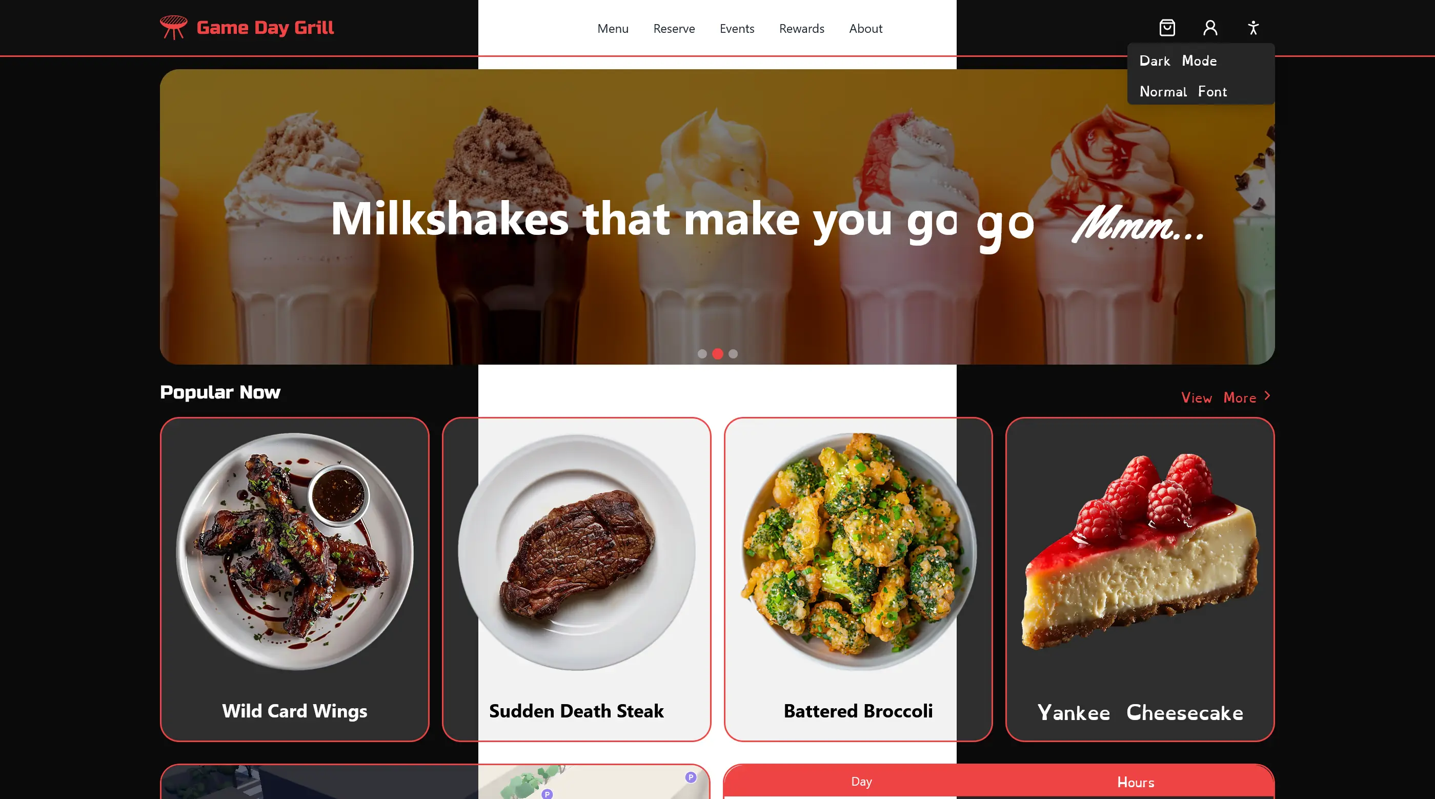
We wanted to make sure our website was ready for the national competition. We added accessibility features to our website to make it more inclusive for all users such as theme switching, keyboard navigation, and dyslexic fonts.
